A P-value Oddity
Most people that have had the misfortune of even gently stepping into the world of statistics will have come across p-values. Some may be brave enough to assert that it tells as about the probability of observing data if the null hypothesis is true, but what does it tell us about the alternative hypothesis?
I want to tell a tale of a statistical oddity that I came across on the coursera statistics course I am taking. I’ll try to keep the incidental points simple without saying anything that is mathematically wrong, my only goal is to make you feel more unsettled about statistics much like I feel.
High Power Tests
Practical examples always help me so I’ll lay out a nice hypothetical example. Let’s say you run a nice little website selling different cheeses (the product is irrelevant, I just like cheese). You can measure the average basket value, namely how much people spend on a single transaction on cheese on your website on average. On your current website the average basket value is £60, that’s right people really love cheese.
Imagine you come up with a new website design that you suspect will increase the average basket value. I have the gift of foresight and I can crytpically tell you that this change will have one of two effects:
- The average value will increase to £61
- The average value will stay at £60
Through a standard A/B test you decide to show 4000 people the old website and another 4000 people the new website. This is a large sample, if case one is true then this is a high powered test, the statistical power here is over 99%. If this true effect exists then you are very likely to find it!
You as a frequent A/B tester know p-values, you always consider values < 0.05 as statistically significant and expect to make false positives 95% of the time. You run your test and observe a p-value of 0.025, quite significant you might say! The probabiltiy of observing your test data under the null hypothesis is very low, but is that enough to reject it?
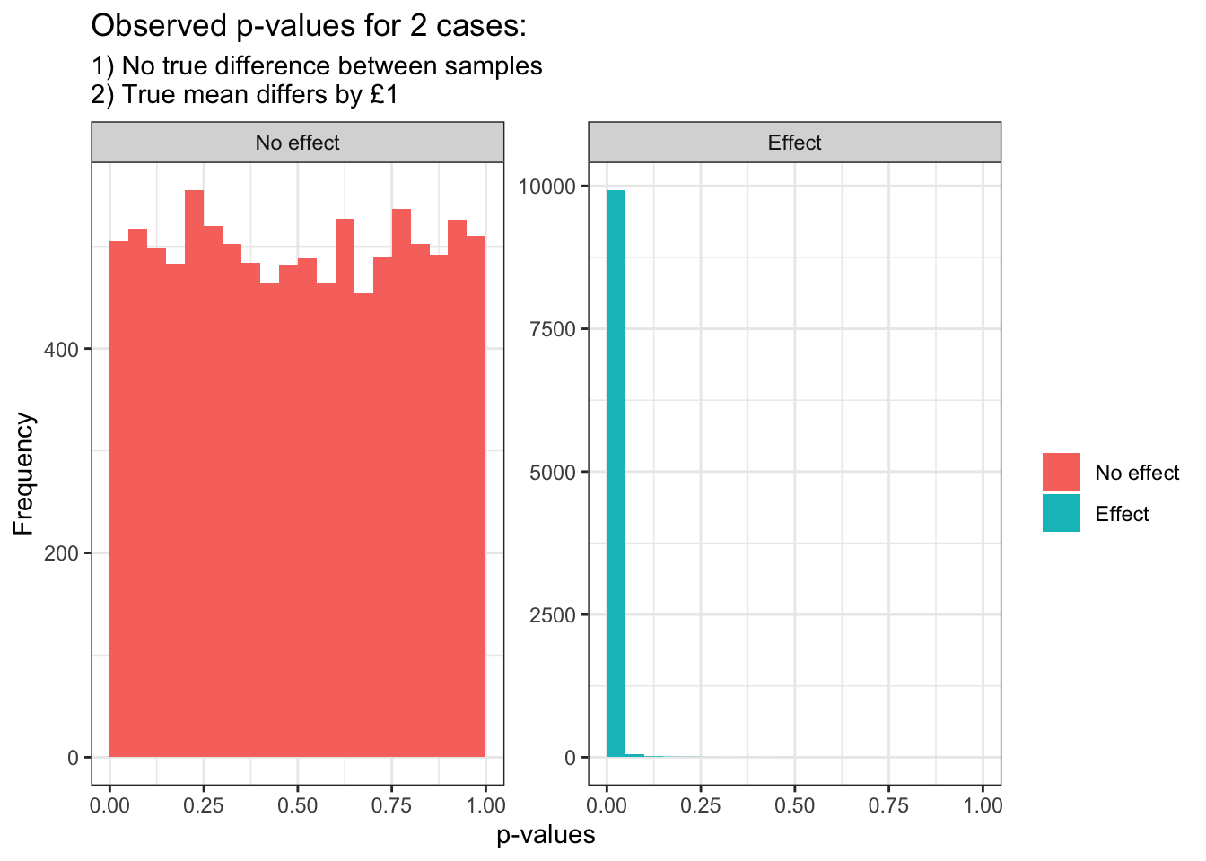
To illustrate the oddity let’s do some simulations. Let’s run the test 20000 times, 10000 times when we know case 1) is true, and 10000 times when case 2) is true. We’ll use a two-tailed t-test, i.e. testing that the mean basket value for our new website is different (more or less) than our original website.
set.seed(23)
# Each sample group should have 4000 participants
n <- 4000
# The old website has a mean basket value of £60
mu_original <- 60
# Case 1) The new website has a mean basket value of £60
mu_case1 <- 60
# Case 2) The new website has a mean basket value of £61
mu_case2 <- 61
# Let's assume the average basket value has a standard deviation of 10 in any
# case
sd <- 10

# We run both simulations 10000 times and record the p-values for each
sims <- 10000
p_vals_effect <- numeric(sims)
p_vals_no_effect <- numeric(sims)

for(i in 1:sims){
    # We draw 4000 random samples from each of the 3 situations
    x1 <- rnorm(n = n, mean = mu_original, sd = sd)
    x2 <- rnorm(n = n, mean = mu_case1, sd = sd)
    y <- rnorm(n = n, mean = mu_case2, sd = sd)
    # We observe the p-values of a t-test in both cases:
    # 1) Old vs case 1)
    # 2) Old vs case 2)
    p_vals_effect[i] <- t.test(x1, y)$p.value
    p_vals_no_effect[i] <- t.test(x1, x2)$p.value
}

p_vals <- data.table(
    rownum = 1:sims,
    "Effect" = p_vals_effect,
    "No effect" = p_vals_no_effect
)
plot_p_vals <- melt(p_vals, id="rownum")
plot_p_vals[, variable := factor(variable, levels=c("No effect", "Effect"))]

g <- ggplot(plot_p_vals, aes(x=value, fill=variable))  +
    theme_bw() +
    labs(
        x="p-values", y="Frequency", fill="",
        title="Observed p-values for 2 cases:",
        subtitle=paste0(
            "1) No true difference between samples",
            "\n2) True mean differs by £1"
        )
    )
g + geom_histogram(boundary=0, binwidth = 0.05, position="identity") +
    facet_wrap(~variable, scales = "free_y")
On the face of it things look great: when there is no effect every p-value is just as likely. This is right because 5% of the time when there is no effect we will see a p-value < 0.05, this is a false positive and we expect it 5% of the time. On the contrary when there is a effect the p-values are almost always really small, so much so we had to rescale the y-axis. We’ll be rejecting the null hypothesis a lot of the time!
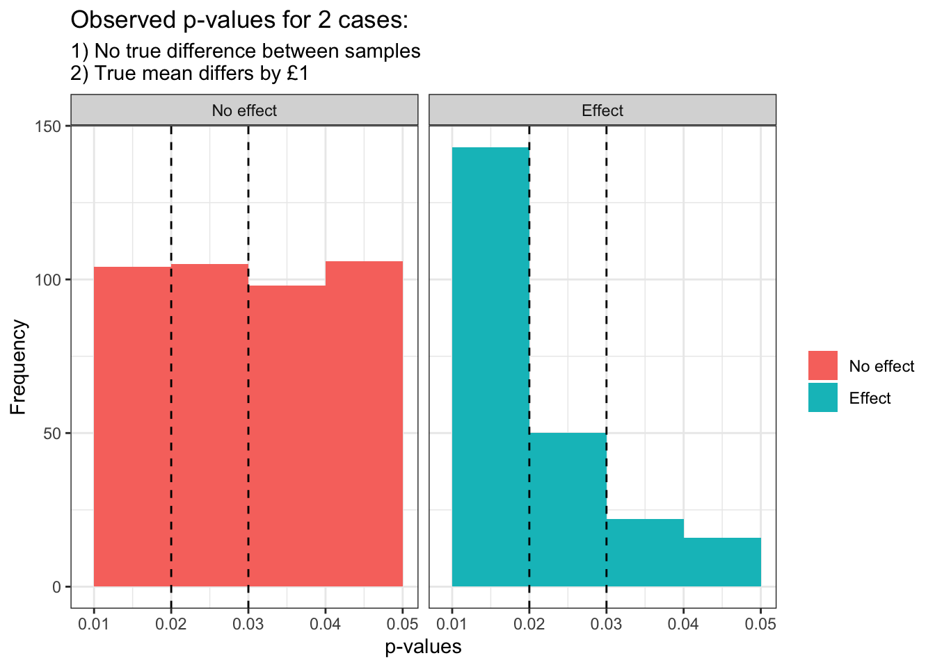
But this wasn’t the question. I said in your single test you saw a p-value of 0.025, below your usual p-value threshold of 0.05 for rejecting the null. Let’s zoom in on our chart and keep the scales the same.
g + xlim(0.009, 0.05) + geom_histogram(
    boundary=0, binwidth = 0.01, position="dodge"
) + facet_wrap(~variable) +
    geom_vline(xintercept=0.02, linetype="dashed")+
    geom_vline(xintercept=0.03, linetype="dashed")
When we look at p-values between 0.02 and 0.03 we see them roughly 1.05% of the time when there is no effect, but only 0.5% of the time when there is an effect! This is because the statistical power is so strong that very small p-values are much more likely when there is an effect (at least for our specific effect of £1 increase). The true sensible conclusion here after seeing a p-value of 0.025 is that we are more likely living in the reality that our new website doesn’t increase the cheese sales, rather than adding an extra £1 to each basket value.
Conclusion
The general conclusion here is that the higher the statistical power the more likely we are to observe even smaller p-values. At some critical point p-values we used to treat as significant (in our case 0.025) suddenly give more evidence that the null hypothesis is generating our data rather than some alternative.
This is as much as I have read on the subject, my aim was only to make you think and worry because that is the ultimate goal of statistics. I welcome any critical feedback or review in the comments below on what I’ve written, and equally I would love to hear of any practical situations where this has been corrected for.
